Why accessibility breaks between design & development
DRANK
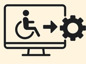
Accessibility often starts strong in design — with thoughtful colour contrast, readable typography, and inclusive interaction flows. But somewhere between design sign-off and development, it starts to crumble.By the time the product reaches QA, features that looked accessible on Figma suddenly fail real-world tests. • Focus order behaves unpredictably • Screen readers miss entire sections. • Captions overlap UI elements • Developers are left scrambling to fix what was once “already designed for